— PROJECT NAME
Stinson Breads
— ROLE
Art Direction
Branding
Illustration
Custom Hand Lettering
Social Media
— DATE
Summer & Fall 2023
— SPECS
Adobe Illustrator
— PAPER
GF Smith 175gsm, 270gsm
(Lavender, Mid Green,
Sorbet Yellow, Vermillion)
Neenah Classic Crest 120 gsm
(Natural White)
Stinson Breads has been a staple for locals in the Opelika, AL area since they were founded in October 2019. Focusing on traditional, sustainable, handmade breads & sweet treats, they have grown quickly, & needed branding that could keep up. As a friend & loyal customer, I was happy to craft a new visual identity for them.
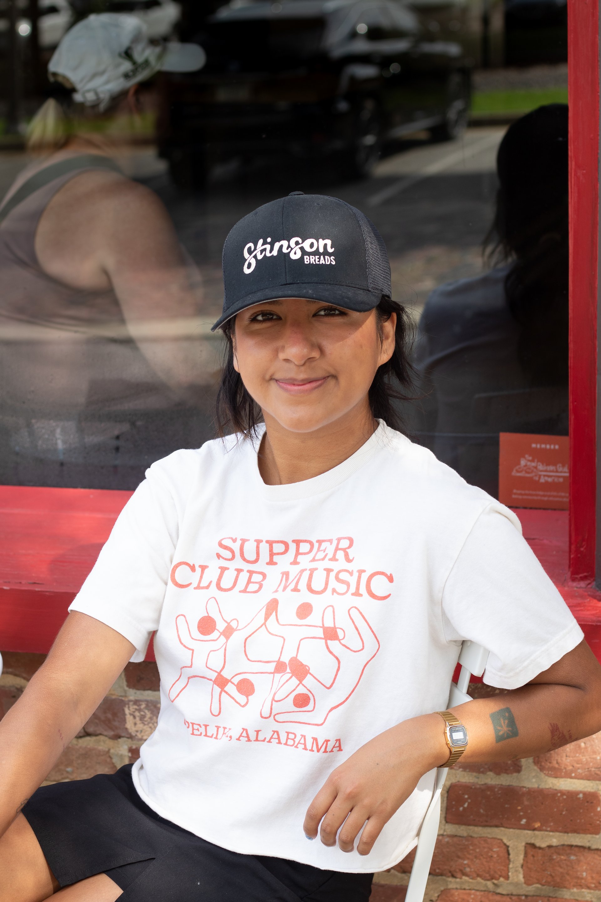
The owners, Matthew and Anna Claire, wanted the brand’s visual identity to reflect both them and their employees, especially as they continue to grow. Tonal adjectives included: welcoming, professional yet friendly, clean, and warm. The resulting visual identity is simultaneously lively and professional. The custom hand lettering provides a sense of play while the earth tones in the colour palette ground the graphics and ensure versatility.
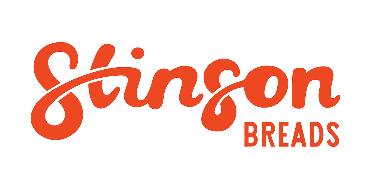

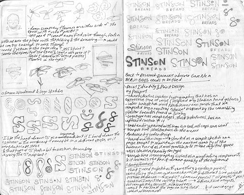
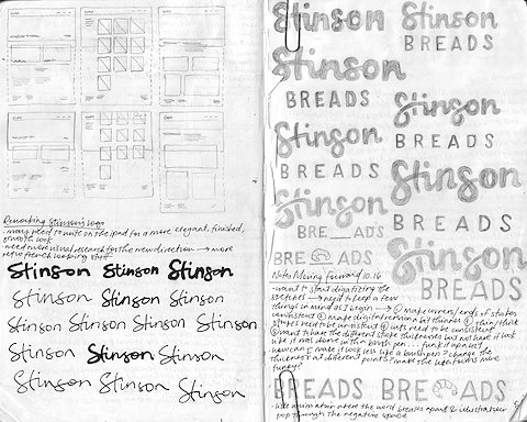
The logo is a vital component of the brand because it is a distillation of the company’s values and personality. This wordmark’s expressive voice communicates friendliness and warmth, two qualities that every customer who interacts with the Stinsons experiences.
The handwritten “Stinson” conveys an approachability and playfulness, communicating that this is a brand for friends, old and new. Wonky proportions and other imperfections keep the wordmark lively while still maintaining a necessary degree of professionalism.
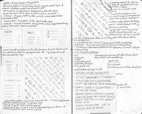
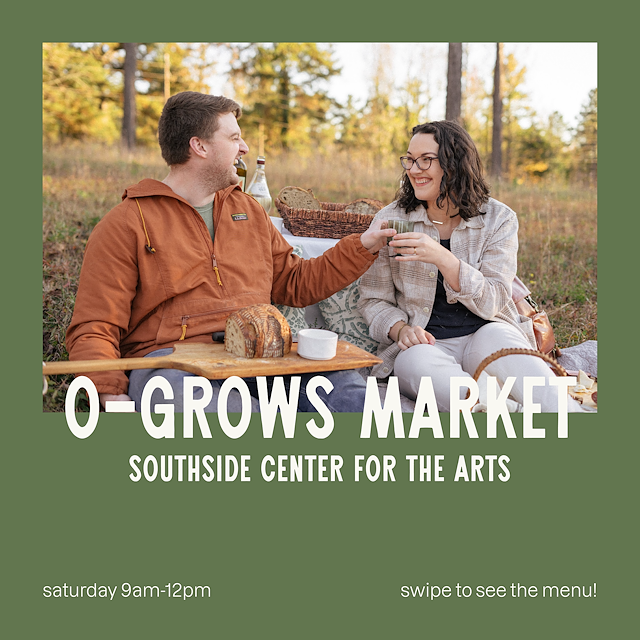
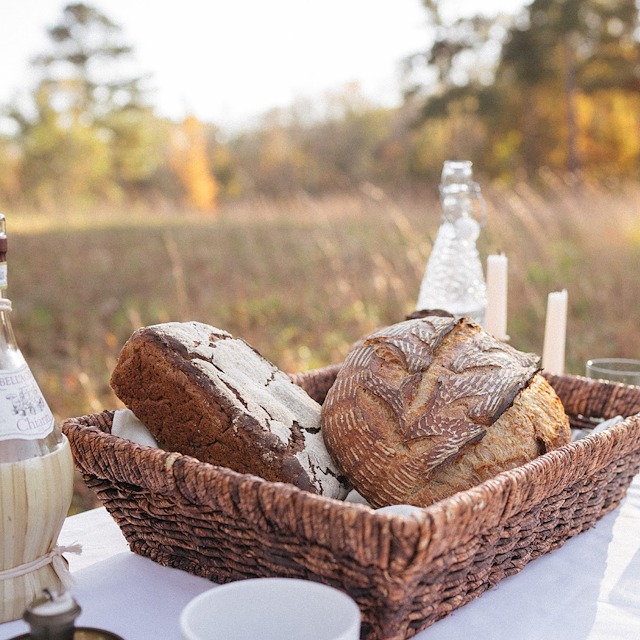
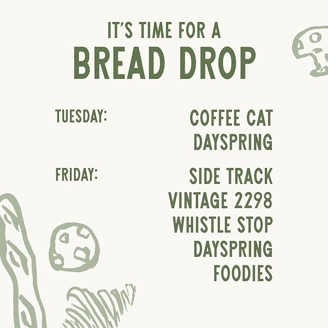
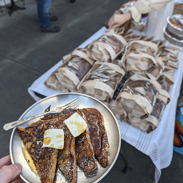
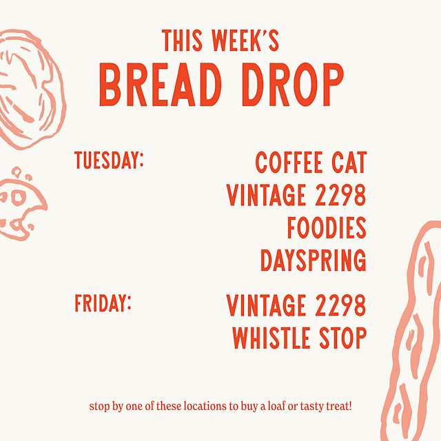
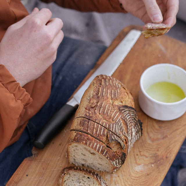
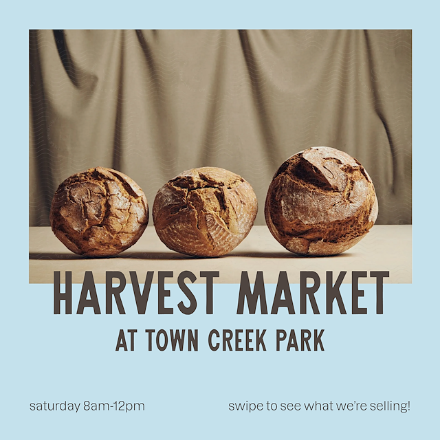
Along with primary & secondary logos, illustrations, colours, & type choices, I designed social media templates as part of this project. Below is an example grid of nine posts, including their photography & a few of my templates.
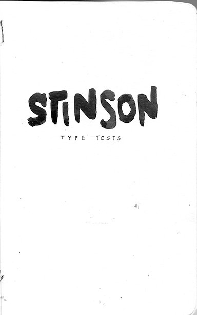
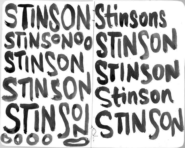
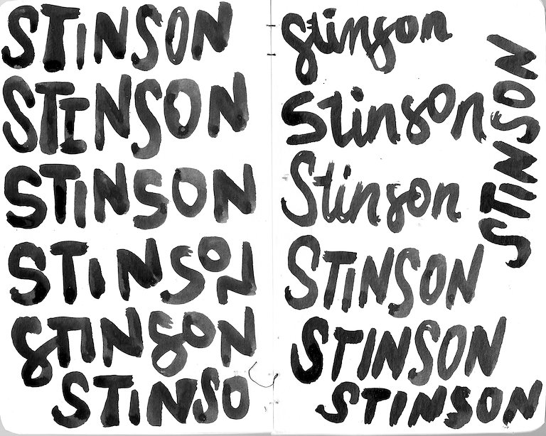
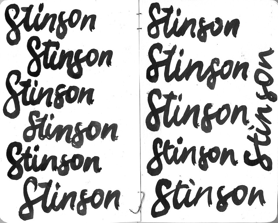
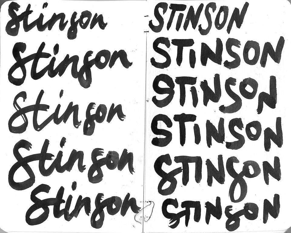
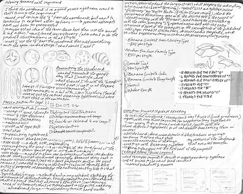
I conducted extensive hand-lettering research for this project and made a small booklet of the specimens. Using different brushes, amounts of ink, & writing styles, I was able to get a handle on the flow of the word and create different examples for the client to look at in the process. Even though the final wordmark was crafted digitally, these writings were a quick way for me & the client to narrow down directions.
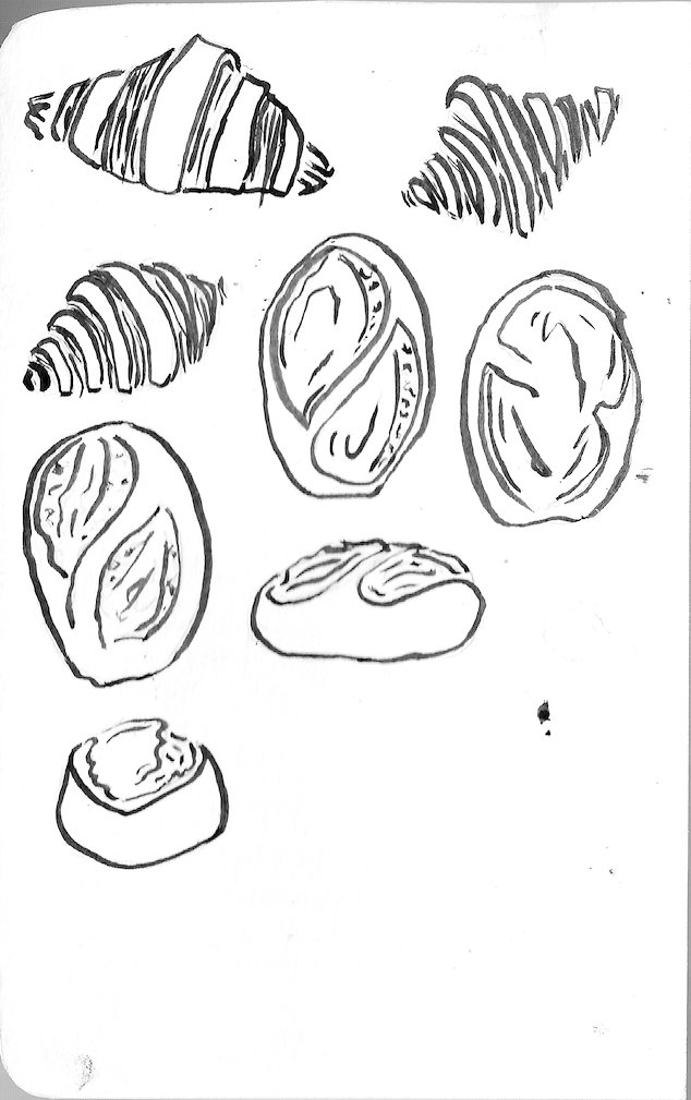
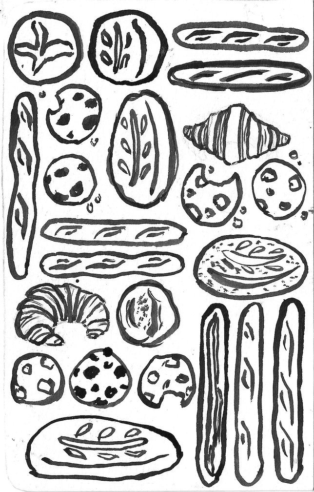
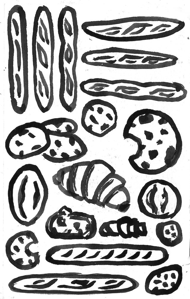
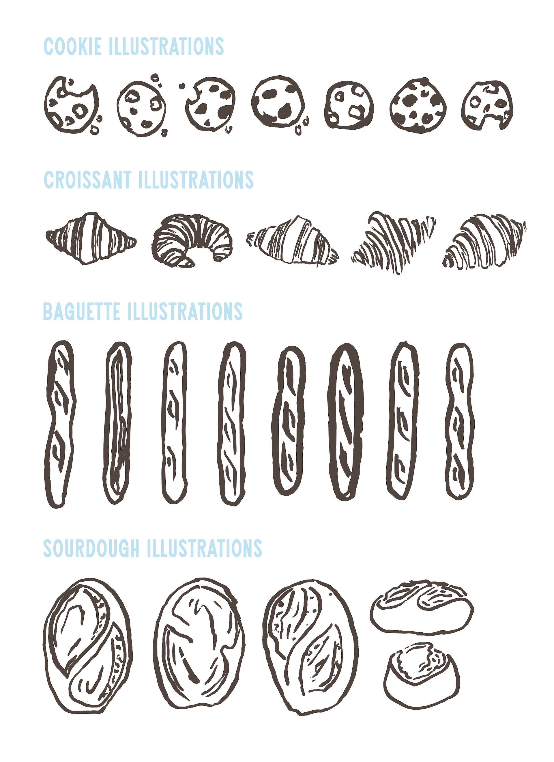
With the same tools, I illustrated their core baked goods in varying thicknesses & amounts of detail. The final versions were selected from these sketches and digitally refined. These illustrations work with the logo to craft the welcoming, friendly tone the Stinsons most wanted to portray.